
Introduction
Delta Components is an open-source registry of modern, accessible React components built on top of shadcn/ui.
Motivation
My first experience with frontend was in 2018, leaning on Material UI and React Bootstrap to move faster. I was drawn to how much you could express through the interface itself (layout, type, colour, motion), a surprise after years spent in C and C++. But building on those libraries always felt flimsy: you pulled in the entire package, the components sat buried in node_modules/, and opting out of a default meant fighting the API. Extracting a component and rebuilding it as my own was a huge amount of work for an amateur.
shadcn/ui flips that model: a CLI hands you the source instead of an npm package, so you own the code from day one. With it and an AI pair in Claude Code, I could build out a custom component registry on my own.
If you want primitives (buttons, drawers, accordions, what-have-you) use shadcn/ui; that's what it excels at. If you're looking for something a little different, or something built to catch the eye, see what Delta Components has to offer below.
Registry Components
Cambio Image
CambioImage is a lightbox-style image viewer with fluid, physics-driven zoom transitions and gesture-aware dismissal. It is a drop-in replacement for any hero, gallery, or inline figure where you want readers to peek at full resolution without a jarring modal. Tap or click to expand; scroll, click, or swipe to dismiss.
Card Deck
CardDeck turns a list into a tactile stack. Swipe left or right to move through each card, simulating the experience of holding real cards in your hand. It suits showcases where each item earns its own moment: checkout payment cards, trading cards, onboarding steps, testimonials, or a portfolio reel.
Product Card
ProductCard is a composable card primitive for anything that looks like a product: shop items, saved bookmarks, a "things I love" list, or a catalogue of projects. Its compound parts (image, badge, title, subtitle, metric) snap together so a grid of cards stays visually consistent without custom layout work per item. The optional badge doubles as a wishlist, favorited, or on sale toggle.
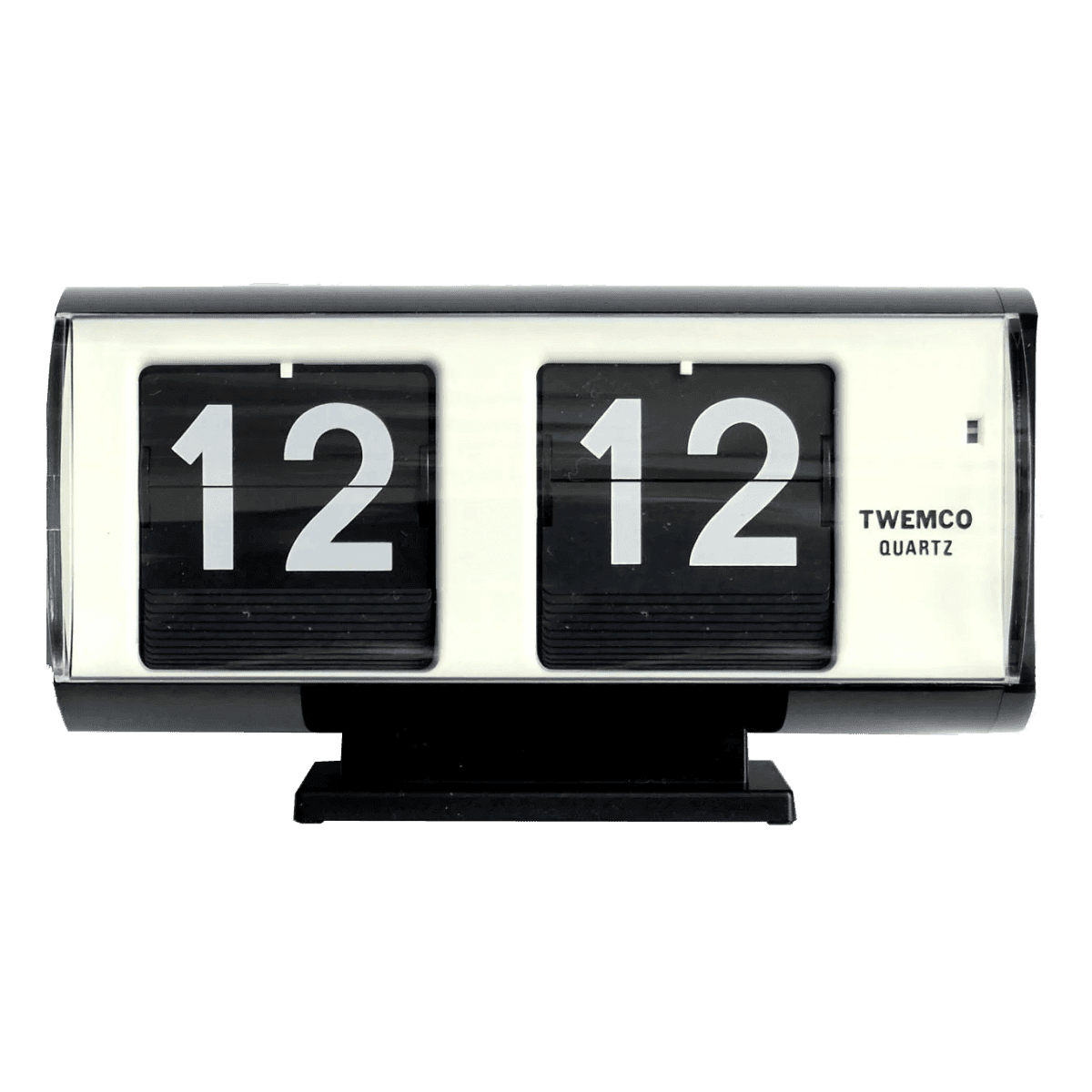
Twemco Clock
Clock
QR Code
QRCode turns any URL or string into a styled QR matrix you can drop inline. It is handy for linking between mediums (print to web, laptop to phone, poster to checkout), and its dots, corners, and colours can be tuned to match the surrounding design or brand. Add a logo in the centre or make it tappable to open the target directly.
Code Block
CodeBlock is a syntax-highlighted code viewer aimed at documentation, tutorials, and landing pages that need to show off real code. It handles filetype-aware headers, copy-to-clipboard, collapsible overflow for long snippets, and a package-manager tabs mode for install instructions. Themes are fully customisable, so the block can match your product's visual language rather than a generic IDE look, via using shadcn color themes as default, or a custom theme like used by the demo below showcasing the Gruvbox Dark Soft palette.
1// A small in-memory task store with priorities and simple search.2// Demonstrates structs, enums, iterators, and error handling.34use std::collections::BTreeMap;5use std::fmt;67#[derive(Debug, Clone, Copy, PartialEq, Eq, PartialOrd, Ord)]8pub enum Priority {9 Low,10 Medium,11 High,12 Critical,13}1415impl fmt::Display for Priority {16 fn fmt(&self, f: &mut fmt::Formatter<'_>) -> fmt::Result {17 let label = match self {18 Priority::Low => "low",19 Priority::Medium => "med",20 Priority::High => "high",21 Priority::Critical => "crit",22 };23 write!(f, "{label}")24 }25}2627#[derive(Debug, Clone)]28pub struct Task {29 pub id: u64,30 pub title: String,31 pub priority: Priority,32 pub done: bool,33}3435impl Task {36 pub fn new(id: u64, title: impl Into<String>, priority: Priority) -> Self {37 Self { id, title: title.into(), priority, done: false }38 }3940 pub fn matches(&self, query: &str) -> bool {41 self.title.to_lowercase().contains(&query.to_lowercase())42 }43}4445#[derive(Debug)]46pub enum StoreError {47 NotFound(u64),48 Duplicate(u64),49}5051impl fmt::Display for StoreError {52 fn fmt(&self, f: &mut fmt::Formatter<'_>) -> fmt::Result {53 match self {54 StoreError::NotFound(id) => write!(f, "no task with id {id}"),55 StoreError::Duplicate(id) => write!(f, "task {id} already exists"),56 }57 }58}5960impl std::error::Error for StoreError {}6162pub type Result<T> = std::result::Result<T, StoreError>;6364#[derive(Debug, Default)]65pub struct TaskStore {66 tasks: BTreeMap<u64, Task>,67 next_id: u64,68}6970impl TaskStore {71 pub fn new() -> Self { Self::default() }7273 pub fn add(&mut self, title: impl Into<String>, priority: Priority) -> u64 {74 self.next_id += 1;75 let id = self.next_id;76 self.tasks.insert(id, Task::new(id, title, priority));77 id78 }7980 pub fn complete(&mut self, id: u64) -> Result<()> {81 self.tasks82 .get_mut(&id)83 .ok_or(StoreError::NotFound(id))84 .map(|t| t.done = true)85 }8687 pub fn search<'a>(&'a self, query: &'a str) -> impl Iterator<Item = &'a Task> {88 self.tasks.values().filter(move |t| t.matches(query))89 }9091 pub fn by_priority(&self) -> Vec<&Task> {92 let mut list: Vec<&Task> = self.tasks.values().collect();93 list.sort_by(|a, b| b.priority.cmp(&a.priority).then(a.id.cmp(&b.id)));94 list95 }9697 pub fn pending(&self) -> usize {98 self.tasks.values().filter(|t| !t.done).count()99 }100}101102fn main() -> Result<()> {103 let mut store = TaskStore::new();104 let id = store.add("write delta components post", Priority::High);105 store.add("reply to emails", Priority::Low);106 store.add("ship mapbox pointer demo", Priority::Critical);107108 store.complete(id)?;109 println!("pending: {}", store.pending());110111 for task in store.by_priority() {112 let status = if task.done { "[x]" } else { "[ ]" };113 println!("{status} {:>2} ({}) {}", task.id, task.priority, task.title);114 }115 Ok(())116}
Admonition
Admonition is a callout box for drawing the reader's eye to something that sits outside the main narrative: a tip, a warning, a caveat, a "read this first". It suits long-form docs, tutorials, changelogs, and landing pages where a plain paragraph would get scrolled past. Pick a type (note, tip, warning, danger, info) or pass a custom icon to match the tone.
Tabs
Tabs is a lightweight tabbed interface for switching between peer views of the same area: think account panels, code examples in different languages, or filters over a shared dataset. An animated indicator glides between triggers as the user moves through them, keeping the active state obvious even on dense pages. Variants (default, underline, ghost) and sizes cover most layouts without custom styling.
Manage your account settings.
Scroll Fade Effect
ScrollFadeEffect wraps a scroll container and softens its leading and trailing edges based on scroll position: the top fade appears as you scroll down, and the bottom fade disappears as you reach the end. It is built on CSS scroll-driven animations, so the bundle cost is effectively nil, and it supports both vertical and horizontal overflow. It suits sidebars, tag lists, changelog feeds, and long inline panes where a hard clip would look unfinished. It's even used on the landing page for this website (but only on desktop, since new Apple iOS added this effect by default in Safari 😎).
Tags
Mapbox Pointer
MapboxPointer is a compact embedded map for pinning a single place on a page. It fits naturally on an About, Contact, or venue page where you want to show "here is where this happens" without handing over a full interactive atlas. An optional label and click-through to directions turn the pin into a lightweight call-to-action.
X Card
XCard renders a tweet inline as a styled card, themed to match the surrounding page rather than X's default chrome. It suits citing a post in an article, embedding a thread excerpt, or backing a claim with its original source, all without the weight of the official embed script. Pass a status ID and an optional caption.
Blocks
Delta also ships larger blocks and full-layout demos: AI Chat Sidebar, Bottom Mobile Nav, Admin Inset Layout, and SaaS Dashboard, plus a growing set of themes named after Irish counties: Dublin, Kerry, Galway, Kilkenny, Wexford, Limerick, and Sligo. The admin layouts carry a little Linear energy, and Bottom Mobile Nav borrows modern native-app patterns like Threads and makes them feel right on the web. Over time, Delta has grown from "a few components I like" into a reusable visual system for the kinds of apps I want to build. Browse the full blocks gallery for complete layouts and design inspiration.
Closing Remarks
Delta Components is useful now, even though it isn't in a season of obsessive maintenance. I'm busy with a new job and other projects, which is a very normal sentence, and a much less exciting one than pretending there's a secret roadmap bunker somewhere. The project is alive, usable, and still something I plan to keep pushing forward when time allows. It's in a quieter phase, not a graveyard.
If you like the work, giving the repo a star genuinely helps. I never did the full build-in-public drumroll with this project, so any signal from you that "this is cool, keep going" rings hard. If you used a component, borrowed an idea, or just enjoyed poking around the demos, that little nod goes a long way; it helps more people find the project, and it gives me a very decent excuse to keep polishing it. Likewise, if you have a component or block you'd like to add to Delta, contributions are welcome.
Happy building!